A slow website can drive visitors away before they even get a chance to see what you have to offer.
Many people know this, and with this in mind, run automated tests at Google or Hubspot or wherever, and then want to take action to speed things up.
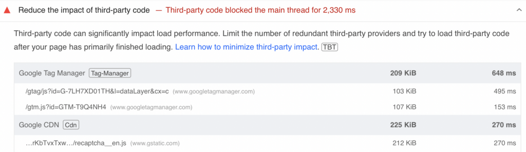
Which is great, but, what I am finding more and more is that these reports are not always practical. More than once I’ve had Google PageSpeed flag Google Tag Manager and other Google code as problems. Not always an option to remove that, Google.
To help cut through some of the noise and anxiety that these reports can cause business owners, we created a list of some of the top things that you can control and take a look at on your WordPress website to improve performance.
1. The Host With The Most
Your web hosting service plays a crucial role in the speed and performance of your WordPress site. Opt for a hosting provider that specializes in WordPress hosting and offers robust server resources, storage, security, and scalable solutions with enough support from the host itself in case any technical issues do arise. While our personal favorite is WP Engine, other hosting platforms such as SiteGround and Kinsta also offer secure web hosting and remain on the list of “hosting companies I am willing to deal with.”
2. A Picture Holds … Way Too Much Data
Large image files are one of the most common culprits of slow-loading websites. By optimizing your images, you can significantly reduce load times. Use tools like TinyPNG or PhotoShop or Canva to compress images without losing too much quality. A good rule of thumb is to keep your image file size as small as possible while still looking OK on the screen sizes you are targeting. Even a full screen photo can be compressed while still looking great. And beware of uploading photos straight from your phone, camera, or stock photo site. Some of those can run large. It is better to compress the images offline, and not rely on WordPress or plugins to “help” because you can have unintended consequences, from crappy looking graphics, to hundreds of extra files in the site.
3. Video Killed The Speed of Your Website

Hosting videos on your website server can consume a lot of bandwidth and slow down your site. Instead, use external video hosting services like YouTube or Vimeo or Wistia. These platforms not only handle the heavy lifting of streaming video content but also provide additional exposure and audience engagement opportunities.
4. Unplug Those Out of Date Plugins

Outdated plugins can not only slow down your site but also pose security risks. Regularly updating your plugins ensures they are optimized for performance and compatible with the latest version of WordPress. Consider performing a plugin audit to identify any that are no longer needed or that can be replaced with more efficient alternatives. Waiting too long to update plugins can cause further issues down the line such as the plugin becoming so inoperable that updating or removing it could break your site in its entirety.
5. Caching Up with the CDN’s
I hate cache. The computer kind, not the money kind. I do. Really. But caching can improve your site’s load times by storing a static version of your site for visitors to access. Use caching plugins like WP Rocket can also help remove some of the hot button triggers that Google PageSpeed and Hubspot complain about. Additionally, a Content Delivery Network (CDN) like Cloudflare distributes your site’s content across multiple servers worldwide, reducing latency and speeding up load times for visitors regardless of their geographical location.
The down side of all this cache is, you may never see edits that you make on your site. Maybe ‘never’ is the wrong word, but, it can take a while for edits to show up. This is especially frustrating during development or any period of many edits. So have patience, if you have a lot of cache.
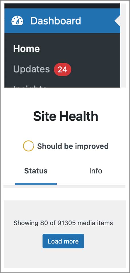
6. Comments and Data and Media, Oh My
An excessive number of comments and outdated data or even too many media items can bloat your database, slowing down your site both on the front end (your customers) and the back end (your marketing and web team). If having comments on your blog posts won’t make or break your users ability to understand the content, then it is best recommended to simply turn off commenting. Because the bots will fill it right up. If you do need to keep comments on so you can engage with a user, looking into tools such as Akismet to manage comments can be useful. Regularly clean up your database using plugins like WP-Optimize, which can help you remove unnecessary data and keep your database streamlined.
While these items are all pertaining to WordPress sites, in the future we will give more knowledge about other website builders such as Wix and SquareSpace and the things that you CANNOT fix or control on these platforms so you have a more informed decision about where you want your site to be developed. Different platforms do different things, and not even all WordPress sites are equal.
Keep it fast, folks.

All in all, A fast-loading WordPress site is essential for providing a great user experience and achieving better search engine rankings.
By investing time and resources into your WordPress site you can ensure that it runs as efficiently as possible. If you have any further questions about your WordPress site we are always happy to help and you can book with us using the following link https://calendly.com/robert-lodi/30min-intro.