• Skip to primary navigation
  • Skip to main content
  • Skip to footer
Rock, Pixels, Scissors logo

Rock, Pixel, Scissors

Your SUPER-powered WP Engine Site

  • About
  • Services
  • Portfolio
  • Blog
  • Contact Us

Robert Lodi

Back to School Basics: 10 Lessons From a Web Developer

August 26, 2025 by Robert Lodi

(Spoiler: Number 10 will blow your mind!)

It’s that time of year again. Kids are back in the classroom, backpacks stuffed with sharpened pencils, and parents everywhere are finally able to have some routine. While they’re learning fractions, spelling, and the periodic table, I’ve been reflecting on some lessons I’ve picked up over the years. Not from textbooks, but from being a freelance web developer.

Turns out, school never really ends. The lessons just look different.

1. Sometimes You Need Some Code

Think of this like high school math. You can get pretty far with a calculator or a no-code builder, but sooner or later you’ll need to actually do the math. The same goes for websites. Out-of-the-box builders are great until you want something truly custom. Then it’s time to crack open some CSS or JavaScript.

2. Invoice on Time

Remember how teachers never accepted late homework? The same applies here. I learned early that if I don’t send invoices on time, I don’t get paid. You can only control how quickly your clients pay by so much with net 15 or net 30 due dates, but if you delay sending the invoice, you’ve just pushed your payment back even further. Staying on schedule keeps the money flowing.

3. Use the Right Tools

Typing up an essay in Comic Sans was never a great look. Sending invoices out of InDesign with duplicate numbers was also not a great look. Once I switched to actual invoicing software, my “grades” in bookkeeping improved dramatically.

4. Speak Your Customer’s Language

Teachers don’t hand you a science test written in Shakespearean English. Why? Because you wouldn’t understand it. The same goes for clients. There’s an old example from the early days of SEO where airlines were optimizing for “low fares” but customers were searching for “cheap flights”. Listen, learn, and use their language in your content.

5. Allow Time for the Unknowns

Procrastinating on a project and pulling an all-nighter is something we have all experienced. But as a developer, I’ve learned that padding the schedule for surprises means fewer late nights and fewer panic attacks. If I think something will take four weeks, I tell the client six. That way, I can be the kid who turns in homework early for once.

6. Just Because I Use a Computer Doesn’t Mean I Fix Them

This one is like assuming your English teacher can also grade your math homework. Just because I work on a computer does not mean I want to – or even know how to – fix your Windows error or troubleshoot your email. I will fail at IT support.

7. You Don’t Have to Do It All Yourself

In grade school, one person could handle a project. These days, websites are more like grad school group projects. They take a team. Designers, developers, copywriters, SEO folks, it’s a village effort. Collaboration isn’t just more productive, it’s more fun and leads to better results.

8. Time Away From Screens is Good

Teachers call it recess. I call it sanity. Breaks make us better. Go outside, stare at a tree, or just look away from the wall in front of you. The internet will still be there when you come back.

Pro Tip: Try to position your computer so it’s not right up against a wall so you can look past the screen more easily.

9. Listen, Then Guide

Students want candy for lunch every day, but teachers guide them toward veggies. The same is true with clients. Listen to what they want, but also recommend what they need.

10. And Finally: Bake Smart

This one has nothing to do with websites, but is still incredibly important. If you’re baking cookies, crinkle up the parchment paper so it lays flat. And say no to silicone baking mats. Trust me.

At the end of the day, whether you’re in a classroom or at a keyboard, the real takeaway is this: learning never stops. And sometimes, the best lessons come from trial, error, and the occasional cookie.

Filed Under: Uncategorized

What Designers Wish Developers Knew

August 20, 2025 by Robert Lodi

(Yes, We’re Turning the Tables This Time)

Last month, we shared a post about what developers wish designers knew. Now it’s time to flip the conversation.

Because as much as we developers love to joke about logo-final-FINAL-v3.png and mysterious button-like shapes with no annotations, the truth is, designers have a few frustrations of their own — and they’ve got receipts.

To gather some real-world perspective, we reached out to our designer community, including a shoutout to the incredible creatives in the Freelance Rockstars Facebook Group led by Julie Cortés.

If you’re a freelancer looking to grow your business, sharpen your communication skills, and surround yourself with smart, supportive people — you’ll want to check it out.

Here’s what designers had to say — and how we can all do better.


Design Is More Than “Making It Pretty”

Good designers don’t just make things look nice. They’re building entire systems that:

  • Support usability and hierarchy
  • Guide the eye toward key conversion points
  • Create consistency across screens and platforms

When developers make small changes like swapping a font, resizing graphics, or adjusting spacing “just to make it work,” it can unravel the logic behind the whole visual experience.

Alicia White of Alicia in the Wild

Our take: Clean builds start with clear communication. Don’t assume. Ask.

Pixel-Perfection Isn’t the Goal — But Precision Still Matters

Designers know the web isn’t print. Things will shift, stack, and reflow across breakpoints. But there’s a difference between responsive adaptation and a build that only vaguely resembles the mockup.

Designers want:

  • Consistent spacing and alignment
  • Proper font sizes and hierarchy
  • Colors and visuals that reflect brand and accessibility standards

Jen Rarey of Rarified Creative

Our take: Pixel-perfection is unrealistic. Pixel-respect isn’t.


Designers Need Communication Too

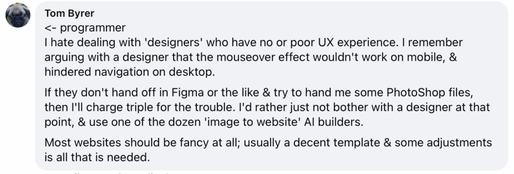
Designers don’t love surprises — and neither do devs. The earlier both parties can collaborate on how things work, the better. Especially when it comes to UX behavior and platform constraints.

Tom Byer

This isn’t just sass — it’s a real breakdown in collaboration and expectations. Whether it’s tools, UX limitations, or platform constraints, devs and designers need to open the door to clearer conversations.

Our take: This isn’t about saving time — it’s about protecting the integrity of the design and the user experience.


Accessibility and Usability Are Shared Responsibilities

Designers think about legibility, contrast, type hierarchy, and button accessibility from the very beginning. Developers are responsible for upholding those choices during the build.

Changes to styles, spacing, or functionality can unintentionally reduce readability or accessibility.

Our take: If a design doesn’t work for web or accessibility standards, it’s a conversation — not a silent substitution.


Respect the Creative Process

Just like developers have systems and standards for writing clean, functional code, designers have a process for building intentional visual frameworks. “Quick tweaks” often have ripple effects.

When developers make changes without understanding the visual logic, the result feels disjointed — and sometimes unrecognizable from the original design.

Our take: Designers aren’t trying to be difficult. They’re trying to keep the product cohesive. Collaborate instead of overriding.


The Bottom Line: Collaboration Wins

Whether you’re on Team Design or Team Dev, the goal is the same:
A clean, functional, well-branded, user-friendly site.

Designers aren’t trying to micromanage. Developers aren’t trying to ignore the design. Most frustrations come from unclear expectations and missing communication.

So talk early. Talk often. Work together. Respect each other’s zones of genius. That’s how great websites get made.

Want a dev team that actually loves working with designers?
👉 Let’s talk.

Filed Under: Uncategorized

What Developers Actually Need from Designers

July 24, 2025 by Robert Lodi

Spoiler: It’s not another file named “logo-final-FINAL-v3.png”

Let’s get this out of the way: we love good design. We love when something is beautiful and functional. But sometimes, in the rush to create something visually compelling, the final design handoff leaves developers… well, scrambling.

If you’ve ever worked with a developer and been surprised at how long it took to “just build the site,” it probably wasn’t the code. It was the gaps.

So let’s talk about what we actually need from designers to bring their vision to life—without guesswork, wasted time, or a dozen zooms and email follow-ups.


File Names Matter (A Lot)

I got this yesterday. It goes… somewhere?

Imagine opening a folder with 47 files named logo.png. That’s what many developers deal with regularly. We get it—different designers and branding studios have their own internal systems for file naming. And that’s fine! But what matters most is that the files you send to your developer are clear, specific, and usable.

Ideally, we want to know three things right away:

  • Who it’s for (the client or brand)
  • What it is (logo, icon, header, etc.)
  • Any relevant details (size, usage, color variant)

When files are clearly named with size, context, or usage, they’re instantly usable. When they’re all called “final,” “revised,” or “export,” we’re playing a game of “what even is this?”

Naming files this way helps us keep everything organized on our end. Especially when we’re juggling multiple projects or referencing assets weeks later. If everything’s called logo.png or FINAL-export-v2.png, it’s a lot harder to keep things clean and consistent in the build.


Fonts, Colors, Specs—Please Send Them

Got a gorgeous PDF? Great. But if you’re not including font names, weights, sizes, color hex codes, and spacing guidelines, we’re left guessing. And while we can guess, we’d rather spend that time actually building your site.

Think of it like this: if you wanted the walls painted blue, but didn’t say which blue, would you be happy if we guessed sky when you wanted navy?


Tell Us What Things Do

If something looks like a button… should it be a button? Apparently not always, for some reason.

Design tools like Figma are incredible, but they don’t tell us intent. If you want a section to scroll, expand, animate, or link—annotate it. Add notes. Draw arrows. Write it in a shared doc. Anything that tells us what’s supposed to happen.

When we see shapes and layers with no explanation, we have to guess what’s interactive and what’s decorative. And here’s the kicker:
If a developer can’t intuitively guess what an element is supposed to do, your users probably can’t either.

From a usability perspective, ambiguity in design usually translates to confusion in the final product. Clear handoff communication = better functionality and better user experience.


Map the Links

If something needs to connect to something else (menu item → page, image → external link, CTA → form), just say so.

This might seem obvious, but it’s one of the most frequent causes of post-launch revisions. A simple map or even a quick bulleted list will save hours


Flexability

While we are also believers in stretching, here we’re talking about the simple reality of responsive web. 

Ever since Ethan Marcotte invented responsive design way back 14-15 years ago, websites have been fluid. One randomly selected client has had users visit their site on 431 different screen sizes in the last month alone.

The point is – web is not print. 

And while our goal is to deliver what you designed, the fact is, elements move around. Text re-flows and can change size. Very few web layouts are pixel perfect exactly the same all the time no matter what. And trying to build sites that exactly match one specific design file like that is slow, and very very very expensive. And almost all of the time, absolutely not worth it.


Respect the Timeline: Dev Takes Time Too

Here’s the truth: development should take just as long as design—maybe more. If your design timeline is 4 weeks, expect at least 4–5 weeks for proper development.

Why? Because implementation, testing, responsiveness, accessibility, performance, and functionality all require careful attention. Rushing development is how you get broken layouts, clunky interactions, and frustrated clients.


TL;DR: Designers, We Love You. Help Us Love You Faster.

The goal is collaboration, not conflict. The smoother the handoff, the better the final product. And trust us, your vision is way more powerful when it actually works the way you imagined.

So the next time you deliver assets to a developer, think like a dev:

  • Are my files clear and usable?
  • Do they explain what things do?
  • Is everything labeled and specced properly?
  • Are we cool with the design/layout changing on different screen sizes and platforms?
  • Did I give them enough time?

Small changes on your end = massive improvements in dev efficiency.

And if you’re not sure what we need? Just ask. We’re not scary (unless you send us another logo-final2.png, then we might be).


Want to send this to your favorite designer? Go for it. We’re here for better collaboration, cleaner launches, and fewer headaches—for everyone involved.

Coming soon: What designers wish developers knew. ‘Cause they don’t know it all!

Filed Under: Uncategorized

Nobody Cares About Your Design

July 9, 2025 by Robert Lodi

Let’s go ahead and ruffle some feathers.

Unless you’re a huge brand like Coca-Cola, Burberry, or Apple, your customers probably don’t care about the exact shade of blue you picked. They’re not obsessing over whether you chose GT America over Helvetica Neue. They’re definitely not emotionally invested in your accent color being called “Moonlit Bay.”

Those brands have spent decades building recognition, emotional resonance, and global awareness. For them, design is part of the product. The visual identity carries weight because it’s been earned and reinforced over time.

But for many businesses, especially SMBs, or startups, customers just want your website to work.
They want it to load fast.
They want to find what they need without guessing.
They want to trust that you’re legit.

That’s it. Or, at least, most of it.


Let’s Be Clear: Design Is Very Important

We’re not anti-design. We’re very pro design-that-works. When design is done well, it builds trust, strengthens your message, and supports your brand and business in a powerful, visible way.

But here’s where things get off track.

  • When weeks or months are spent obsessing over microscopic details that no user will ever notice or care about.
  • When development is squeezed into a fraction of the timeline while the team debates which font feels “more convivial.”
  • When months are spent on designing for one screen size, while ignoring mobile and the actual site traffic and user personas.
  • When the idea of perfectionism delays a site that could be driving leads and sales and helping your prospects and customers.

That’s when “design” stops adding value and starts becoming…dare I say…a problem.


What Customers Actually Notice

Here’s some reality:

  • Customers probably don’t care if your H2 heading is 24px or 2.5rem. They care if it overlaps a button on their phone.
  • They don’t care exactly what hex code you chose. They (and ADA requirements) care if the text is too light to read or doesn’t have enough contrast.
  • They don’t care if your hero image is custom photography or a high-end brand element or stock. They do care if it takes 19 seconds to load.

If your website looks amazing but frustrates users, it’s not doing its job. And if your team spends more time tweaking colors than finalizing content or ensuring functionality, it may be worthwhile to rethink some priorities. 


Perfectionism is a Launch Killer

We’ve seen it too many times.

  • Three weeks of back-and-forth over font weights with no final files delivered.
  • Endless tweaks to spacing while placeholder text is still in the hero section.
  • Beautiful branding assets in formats the dev team can’t always open.

Meanwhile, the dev timeline shrinks. The budget stretches thin. And the website that was supposed to launch last month – or last year – is still not live and is not helping your business.


What If You Launched Sooner?

Here’s a wild idea.

  • What if you gave three weeks of font and color and stock photo debate time to development instead and launched early?
  • What if you launched with 90% design and real, functional, good content?
  • What if your branding team delivered web-ready assets instead of a beautiful PDF? Or *gasp* a PowerPoint?

Sometimes the MVP, the minimum viable product, needs to come before the MVW, the most visually wowing.


It’s Not Anti-Design. It’s Pro-Launch.

We’re not saying design and branding don’t matter. We’re saying they shouldn’t be a barrier to progress.

Your website should be beautiful. But in addition to that, sometimes maybe instead of that, it should work. 

It should sell. 

It should support.

It should exist. 

Because the most stunning site in the world won’t help your business if no one can find it or use it. And a perfect design that never makes it out of the Figma file doesn’t help convert many leads.


Designers, developers, and clients all want the same thing.

A site that looks amazing, works well, converts, and makes an impact. 

So launch already. Iterate often. Test things. Focus on what really matters to your market.

Your audience will thank you.


If you made it this far – thanks. A little context. At RPS, we work with many clients and designers directly. We also work with several agencies, sometimes as the third or fourth partner agency in the project. And sometimes…we are handed website designs and specs, at the last minute, that have been approved…but have never been seen by anyone outside the design group and the client. This can be…a challenge. While our goal is always to make it work, and work well, sometimes reality intrudes. This is where a little communication, collaboration, and flexibility go a long way. 

Because reality doesn’t always care.

Filed Under: Uncategorized

How to Actually Use Google PageSpeed Insights (Without Losing Your Mind)

June 24, 2025 by Robert Lodi

If you’ve ever run your website through Google PageSpeed Insights and found yourself spiraling into a pit of red errors and conflicting advice, congratulations—you’re just like the rest of us.

We try hard to do the development side well, but we can’t always control the content and SEO.

Let’s be real: PageSpeed Insights is like that overly honest friend who points out a wrinkle in your shirt and then recommends you change your entire outfit. It’s not wrong… but it’s also not always helpful.

First: What Google PageSpeed Is

Google PageSpeed Insights is a performance analysis tool that tells you how fast your website loads on both mobile and desktop. It gives you a shiny little score out of 100, which, let’s face it, is basically the SAT for websites—stressful, often misleading, and sometimes based on things you can’t change.

The tool runs audits using Lighthouse, Google’s own performance engine, and checks things like:

  • Time to First Byte (TTFB)
  • Largest Contentful Paint (LCP)
  • Cumulative Layout Shift (CLS)
  • And a laundry list of code-related recommendations

Sounds helpful, right? Well… mostly.

Not All Warnings Are Created Equal

Here’s the kicker: some of the things PageSpeed flags are completely out of your control. In fact, we’ve seen it call out Google’s own tools—like Google Analytics or Tag Manager—as performance issues.

You read that right: Google complains about Google.

So before you fire your dev team or rip apart your plugins, know this:

🛑 You Can’t Always Fix✅ You Should Fix
Google Analytics scriptsUncompressed images
Core website assetsLazy loading missing
Third-party embed codeRender-blocking CSS/JS you added
Fonts hosted externallyUnused plugins/themes

If it’s hard-coded by a plugin, theme, or necessary third-party integration, chances are it’s not worth obsessing over. Your goal is real-world speed, not hypothetical perfection.

The Easy Wins That Do Matter

Here’s where we shift from doomscrolling red flags to taking smart action. These are the things PageSpeed flags that are actually worth your time:

✅ Image Optimization

Compress large images and use WebP where you can. No one needs a 5MB hero banner.

✅ Reduce Unused Plugins

You don’t need five different slider plugins. If you’re not using it, lose it.

✅ Enable Browser Caching

Make it easier for repeat visitors to load your site quickly.

But Don’t Stop There…

PageSpeed is a decent starting point, but it’s not the whole picture. We also use WebPageTest.org because it shows you things like:

  • Your load waterfall (fancy way of saying what loads, when, and how much it slows things down)
  • Time to Interactive (TTI)
  • What’s really bloating your site

Sometimes, it’s not one big issue—it’s a hundred little ones throwing a party and not cleaning up after themselves.

Final Word: Fix What Matters, Ignore the Noise

If your PageSpeed score is making you question all your life choices, take a breath. Scores are helpful—but context is better.

Focus on:

  • Making your site usable and fast for real humans
  • Prioritizing issues that actually affect user experience
  • Ignoring the stuff no one on Earth can control (looking at you, Google Fonts)

And if you want help figuring out what to fix first?
📬 We’re just a message away. Let’s take the guesswork out of speed and get your site humming like it should.

Filed Under: Uncategorized

Accessibility Isn’t Just a Checkbox—It’s Good Business (and Great Web Design)

June 17, 2025 by Robert Lodi

Let’s get one thing straight: website accessibility isn’t just about compliance. It’s about people.

Real people. With different devices, different abilities, different ways of navigating the web—and every single one of them deserves a site that doesn’t make them want to chuck their phone out the window.

At RPS, we don’t just optimize for speed and SEO. We care about making the web better—and that includes making it usable for everyone.

So, What Is Website Accessibility?

Accessibility means your site can be used by all people, including those with visual, auditory, motor, or cognitive impairments. That includes:

  • Screen reader users
  • Keyboard-only users
  • People with color blindness or low vision
  • Folks who need more time or clearer navigation

It’s not just about building for “them.” It’s about building better for everyone.

Here’s the Big Misconception

A lot of businesses think accessibility means slapping an ADA plugin in the footer and calling it a day.

Spoiler alert: It’s not.
(And those plugins? Often a band-aid. Sometimes a lawsuit magnet.)

Accessibility Is Performance

Did you know that many accessibility improvements also improve your site’s speed and SEO?

  • Using proper HTML headings = better for screen readers and search engines
  • Image alt text = helpful for vision-impaired users and Google indexing
  • Clear navigation = helpful for motor-impaired users and bounce rates
  • Faster load time = better for everyone (especially those on mobile or assistive tech)

It’s all connected. Fixing accessibility often means you’re also creating a smoother, faster, and more user-friendly site. Win-win.

Common Accessibility Issues We See All. The. Time.

Here’s a quick list of things we (lovingly) roast in audits:

  • Missing or duplicate <h1> tags
  • Buttons with no labels (looking at you, hamburger menus)
  • Text with terrible contrast ratios (grey-on-grey crime scenes)
  • Forms that can’t be submitted with a keyboard
  • Images with no alt text
  • No skip links or accessible navigation paths

Accessible Design Is Better Design

Here’s the thing: when you build with accessibility in mind, everyone benefits.

  • Your site is easier to navigate
  • Your bounce rate goes down
  • Your conversions go up
  • You avoid legal risk (yep, that too)

Oh—and your site won’t feel like it was built in 2010 by a guy named Jeff who only tested it on a single desktop browser.

Want Help Making Your Site More Accessible?

We’re not here to shame. We’re here to help you fix what matters—so your site works for more people, loads faster, ranks higher, and leaves a better impression.

📥 Reach out for a friendly audit. We’ll show you what needs attention, what’s working well, and what you can ignore (for now).

Let’s make the web a little more human—together.

Filed Under: Uncategorized

  • Go to page 1
  • Go to page 2
  • Go to page 3
  • Interim pages omitted …
  • Go to page 8
  • Go to Next Page »

Footer

  • About
  • Services
  • Portfolio
  • Blog
  • Contact Us

Stay in the loop: Newsletter coming soon.

Sign up here

Contact RPS

[email protected]

508 380 7213

Copyright © 2025 · Rock, Pixel, Scissors · All rights reserved · Privacy Policy · Terms and Conditions